
ZORSE
A Comic by RAMZEE
Tones – Liz Greenfield
Digital Design – Keiran Chilvers and RAMZEE.
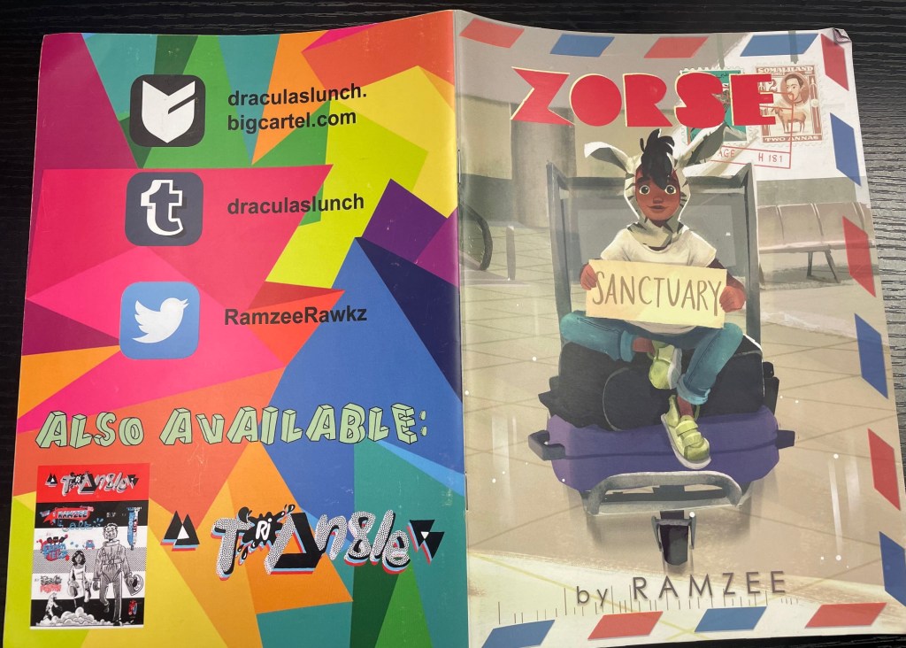
Cover Art – Abigail Dela Cruz
Made in Great Britain by Draculas Lunch – £5.00 – 32 pages.
The Story – ‘BAXTER BRADLEY (Editor – not sure why this is in capitals?) is the biggest snoop in ‘Nappy Valley’ (Battersea, London) where the anthropological delights are very Middle Class. This all changes when Kamal, a refugee from Somalia, joins his class and Baxter is introduced to a brand-new world outside his affluent social oasis.’
The comic is described as ‘colour’ on the Big Cartel page but is in fact almost entirely black and white with only the odd spot of colour and some end papers on tinted paper.
Postage – I paid £5.00 postage on this comic. There was some communication between me and the creator about a delay in the book arriving/being sent. This resulted in Ramzee posting me a copy First Class and it arrived within a day. I will leave the below photo for you to decide if £5 is a bit much. May I also add that the comic was not in a bag, had nothing extra with it and was in an envelope you can easily buy for 25p. Comics will often bounce about in envelopes that are too big for them and this one suffered from some turned/folded corners.

I’m guessing that this extra money is going to a charity. I can’t see anything in the book or on the Big Cartel about that, however. At £5 the comic itself sits on the shelf at a good price. But if you are charging such a large amount for postage questions should be asked.
The Cover – This is a well-designed cover with art by Abigail Dela Cruz. The cover corners and outer edges imitate the styles of international letters, and this was a clever little tweak. The art has a strong central image in a colourful post-animation vibe. It also manages to tell a story. It is a little on the nose perhaps for someone with a more sophisticated taste but nevertheless I’m sure would make for something to be picked off a shelf during a browse. The back cover however is an attack on the eyes and looks like it was drawn on a laptop from 1998.
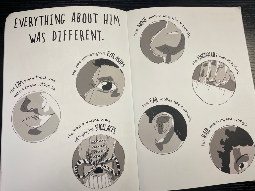
The Review – The theme of this comic is indeed worth talking about. Our acceptance of people who are different from ourselves and our own limited view of the planet is something that should be discussed. I came from a diverse area of West London and firmly believe that it was the contact with other communities and cultures that enriched my young life. Consequently, I didn’t really learn anything new from this comic but many may. In the case of this release its intentions and narrative can be viewed as one and the same. It has an autobiographical/biographical approach and addresses the themes of race and childhood. The style of storytelling has a juvenile scrapbook/exercisebook and intentionally haphazard look to the pages. Some of these pages are scant of illustrations and some are a disorganized jumble that to me signifies the attitudes and lives of primary school age children and scrawlings in their class workbooks. This jumble however makes for an annoying pace.
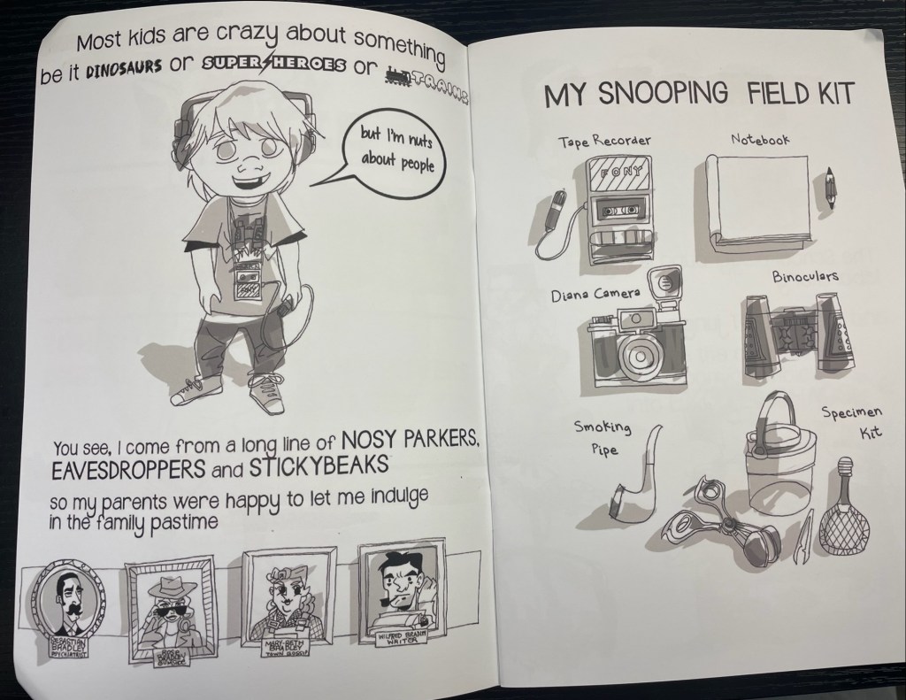
The art mimics the instinctual childlike scribblings of children of the age but does vary depending on where you are in the story. There are some intriguing uses of page layouts on show here including a faux Monopoly board signifying the judicial Immigration Act admittance procedures. I can see what Ramzee was going for here, but the lettering is tiny and packs repetitive images into a page that had it not been something I was reading for review I may well have skimmed over. I found some of the dialogue a little forced, inauthentic, twee and obvious and had me wondering who this book is aimed at – Kids? Their parents? Comics readers? If a wider audience was being sought then a signpost should be added to where people can help. I also feel that it could have been laid out more consistently. It jumps jarringly between formats and styles and feels like a collection of single pagers that have now been collected. Some spreads almost feel like infographics, some like newspaper strips and some like a page from a much longer graphic novel. This reduces some moments to nothing more than a cliche.
The book also gave me the impression that there is an occasional and amateurish attempt to emulate the line of Quentin Blake and then is in turn mixed up with a more modern zine aesthetic. I found this jumble clashed against the uneven lettering style that didn’t make for an uninterrupted reading experience. I kept having to figure out where to read next and as a comic reading experience the flow was annoyingly staccato.
In Conclusion – As a purchaser I have to say that I’m not sure I got value for money or a valuable reading experience. I also received a slightly battered copy after having to chase the creator with two messages and an email. The book jumps about a little too much in tone and visuals and I found it an extremely obvious, hollow and unemotional reading experience that is not sophisticated enough for its important subject matter. I also feel that it is missing a trick by not adding the contact details to charities and organisations who raise money and awareness (and help) for the issues it addresses.
It definitely feels like it could have done with the eye of a good editor. The tinted text pages at the end of the book are bland and dull at a first look and this could have been vastly improved. The back cover is genuinely just a mess. With some tweaks Zorse would easily be a valuable resource for school kids for example.
You can buy a copy here and follow RAMZEE on Twitter here.
Many thanks for reading.
